Dangerous Thunderstorms Predicted for Southern Plains, Midwest
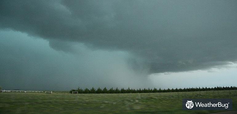
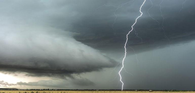
Another low pressure system tracking across the central U.S. will produce severe thunderstorms today.
Read MoreAnother low pressure system tracking across the central U.S. will produce severe thunderstorms today.
Read More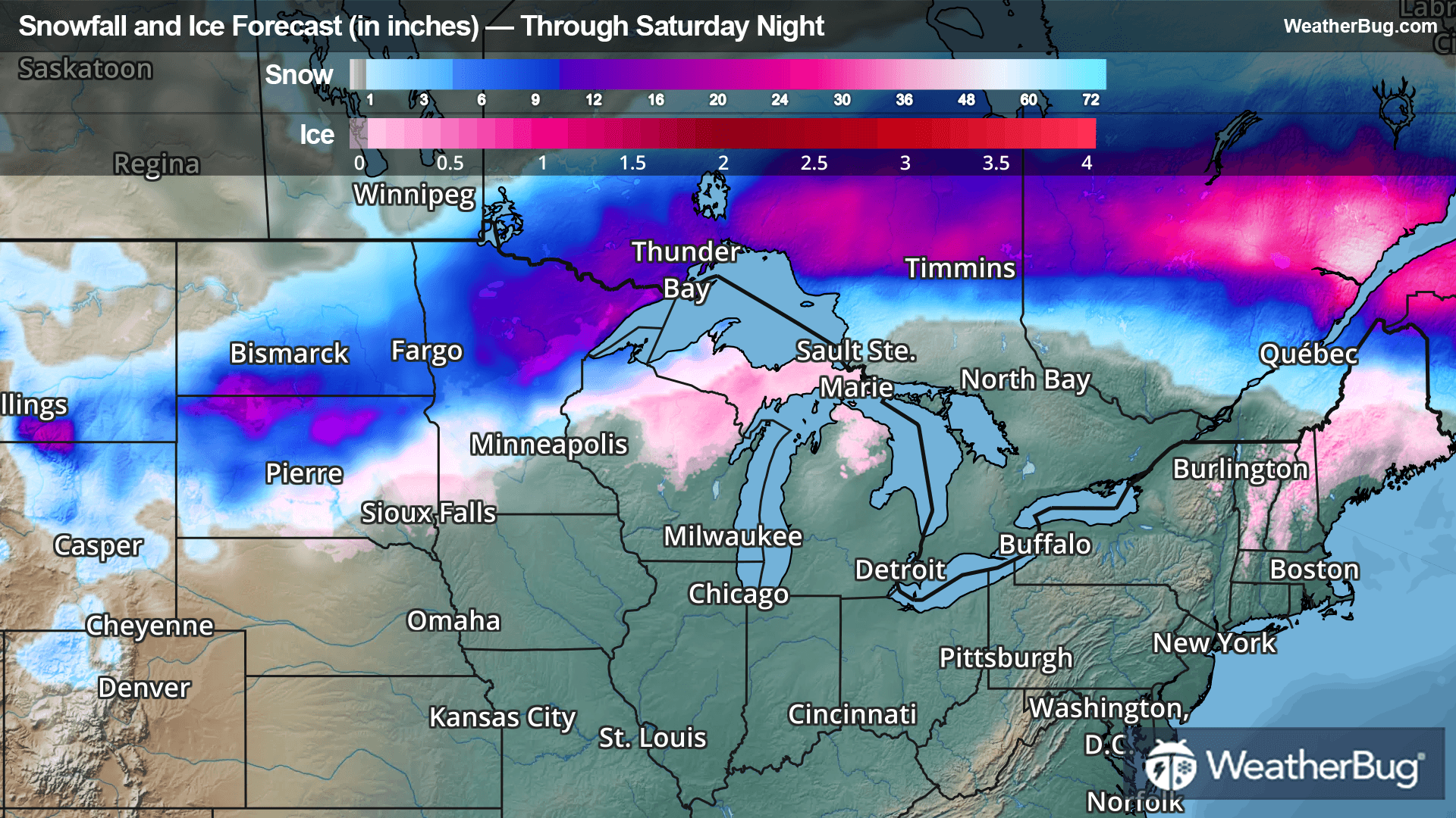
Late season snow and ice will move across the northern states today through Saturday night.
Read More
A potent weather system traverses the U.S. this weekend, bringing everything from accumulating snow and ice to rainy, stormy weather.
Read More
A widespread drying trend afflicted much of the U.S. this week, causing drought to worsen substantially.
Read More